GAME DESIGN
Let's Make A Deal
MAKE IT WAYNE
The idea was to create an interactive game experience. The rainbow, using RGB XL PixelControl LED ribbon, allowed for higher resolution of light and more detailed animation. That means, each section is individually chambered and every pixel within that chamber is individually controlled. In addition, it provided a wide range of color-changing and chasing effects along with control over speed, brightness, and direction. The RGB cloud had two lighting channels with flexibility in lighting and animation. The pot of gold had a wireless monitor, with custom-built wireless confetti cannons that exploded on a win. The art-directed style was a combination of backlit surfaces and brushed aluminum trim and all elements were wireless DMX controlled.
Price Is Right
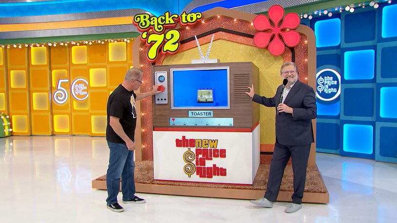
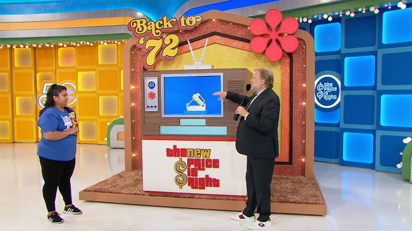
BACK TO '72
This game was so fun!
Price Is Right
TO THE PENNY
This game was designed to push boundaries. The coin spins while the sign flies in from the grid. Every 1/16 of an inch mattered on how the product boxes lined up. Monitors, light boxes, and graphics all demanded their own space and came together beautifully in the end.
The Price Is Right
VEND-O-PRICE
Vend-O-Price was designed with the aesthetic of a 1950's retro cigarette vending machine. There were multiple complications to overcome with this game design including the game needing to fit on a turntable with very tight and precise size restrictions. Additionally, the stage lights created distracting reflections and threatened to wash out the backlit surfaces. Troubleshooting with the graphics department, a special printing technique was developed that achieved chrome-like reflections when the light hit the unprinted, glossy white detailing on the exterior panels. In addition, the same translucent material was used for various backlit panels that resulted in a warm glow. Additional details included a coin slot with custom Drew Carey coins that opened a retractable door and exposed the products inside. Upon a win, the game lit up with flashes and animates.
The Price Is Right
HOT SEAT
This game was a monster! The limitations of storage, available grid space, and crew muscle all played a factor in the design. Built-in two sections, a 15-foot platform was lined with five RGBW lightbox podiums, each engineered with a custom trillion reveal. The massive chair had a weight capacity of 300 pounds and glided smoothly across the track. An interactive control panel and timer added detail and the 8-foot tall chrome-lined thermometer had individual chambered lightboxes to mimic the increase in temperature on each stage of gameplay. To create a dynamic finish, the sign can was a lightbox and animated on a win.
The Price Is Right
SIDE BY SIDE
This game was like the ‘Little Engine that Could’, a little game with a big punch! The brief was to keep the footprint small and the game design and mechanism simple. Being a game show, the target audiences tend to be drawn towards and resonate with nostalgic styling when it comes to the game's look and function. For this game, I drew inspiration from the iconic neon diner signs of the 1970s and ’80s. An important aspect of this design process was getting creatively resourceful with what already existed. In reimagining the overall design the complete gameplay mechanism was reused and most of the remaining set recycled, breathing new life and dazzling energy into a tired game.
The Price Is Right
3 STRIKES
This game was a commanding presence both in size and design. The brief was to use the existing bones and recycle as much as possible which spoke to my creative resourcefulness. In the design process, I was drawn to the vastness of the famous Fenway Park baseball field and its classic, traditional scoreboard. With this inspiration in mind, I set about creating a game that captured that same spirit for the Price stage. There were challenges to overcome with regard to the size where the game needed to come through stage doors and be maneuvered into place. To work around the height parameters, the upper deck of the game was designed with a hinge which enabled it to lay flat when moving on stage and also assisted with more compact storage. The design stayed true to the simplicity of Fenway Park’s scoreboard creating a feeling of nostalgia. Small unique features were peppered in like the ball bag that was custom designed and stitched by hand by an exceptional seamstress at CBS.


